
Visualizing climate extremes: Climate Jellyfish for Italy, the new high-resolution tool by CMCC
A new high-resolution visualization tool developed by CMCC reveals not only how Italy is warming, but also how climate variability and extremes are evolving across the country. Combining observational and high-resolution climate data in an intuitive and dynamic format, the new service makes complex climate signals accessible down to the provincial scale.
A new service developed within Dataclime, led by CMCC researchers, introduces an innovative way to monitor and communicate climate change across Italy: Climate Jellyfish for Italy. The tool allows users to explore how temperature anomalies evolve over time across Italy through dynamic visualizations inspired by NASA’s Scientific Visualization Studio.
After the service based on the well-known Climate Stripes, Climate Jellyfish are a further step forward in climate understanding and visualization. Whereas the Stripes show annual mean temperature anomalies, the Jellyfish add an additional layer of information by displaying the full distribution of temperatures over time. This allows users to visualize not only long-term warming trends, but also variability and extremes – offering a more complete picture of a changing climate.
“In this sense, Jellyfish provide a more detailed and expressive representation of the climate in motion,” says CMCC scientist Paola Mercogliano, “capturing how temperature conditions shift across years not only simply in terms of averages but also on extremes and other relevant aspects of climate variability.”
A distinctive feature of this new tool is its spatial resolution. Unlike the original global Climate Jellyfish concept developed by NASA, the CMCC implementation provides a detailed view of the entire Italian territory, with data available down to the provincial scale. Users can explore and download visualizations for each Italian province, enabling highly localised analyses useful for research, planning, and climate communication.
The Climate Jellyfish are built on a combination of observational and model-based data: a multi-source approach that ensures robustness while allowing for fine-scale territorial detail.
Two complementary visualizations are available. The first focuses on land surface temperature anomalies, which reflects the radiative temperature of the Earth’s surface and is influenced by land cover, vegetation, soil moisture, and urbanisation processes. Anomalies are calculated relative to the 2000-2020 baseline.
The second focuses on air temperature anomalies derived from reanalysis datasets. In this case, anomalies are calculated relative to the 1991–2020 climatological baseline.
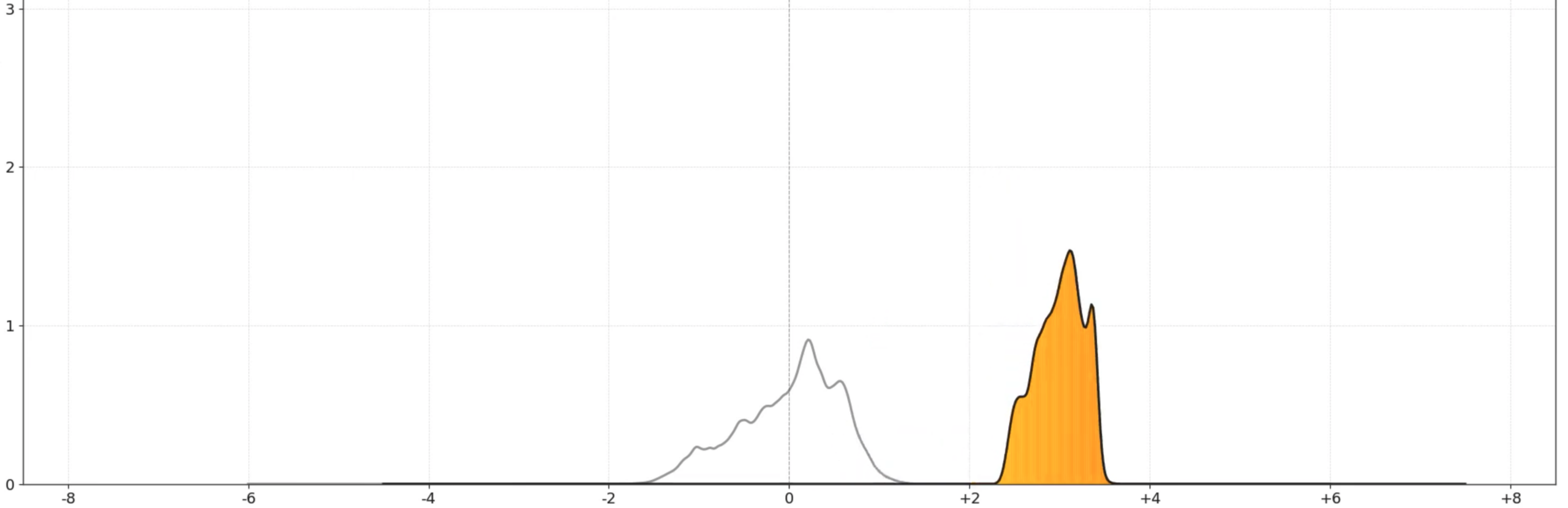
Both use an intuitive colour scale ranging from blue (below average temperatures) to orange and red (above average temperatures).
Beyond mean anomalies, the Jellyfish also capture variability and extremes, providing a more comprehensive representation of climate change signals than traditional visual tools. This makes them particularly useful for identifying local warming patterns, understanding urban heat dynamics, and supporting climate-related communication and awareness activities.
In the visualization, the horizontal axis represents temperature anomalies relative to the 1991–2020 climate baseline, while the vertical dimension shows how frequently different temperature conditions occur. As the years progress, the “jellyfish” shape shifts and changes form, revealing not only the long-term warming trend but also the growing variability and increasing occurrence of extremes. Warmer conditions become progressively more frequent, while the distribution broadens, reflecting the fact that climate change is not simply raising average temperatures uniformly, but also altering the range and intensity of temperature conditions experienced across the territory.
All visualizations are interactive and can be explored at national or provincial level. Users can access time series, trends, and data quality indicators, ensuring transparency and robustness in interpretation. The service is freely accessible upon registration on the Dataclime platform.
“By combining scientific rigour with intuitive visual storytelling, the Climate Jellyfish aim to improve how climate change is communicated and understood,” says Mercogliano, “bridging the gap between complex datasets and public awareness.”
More information:
Satellite observations are used to derive land surface temperature, while air temperature anomalies are based on high-resolution reanalysis datasets, including CMCC’s VHR-REA_IT (Very High Resolution Reanalysis for Italy) and FAIR datasets developed by Dataclime.